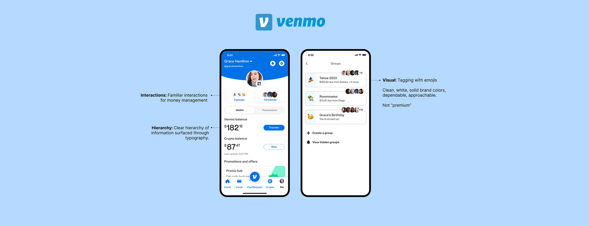
Amalgamic
RESEARCHUI/UXAPPAI
Reimagining Bill Management in Personal Finance
Amalgamic is a fintech startup building a bill aggregation and payments platform. It connects bank accounts, surfaces recurring dues in one place, and lets you pay without switching apps.
Timeline: 4 months
Role: End-to-End UX Research, Product Positioning, UI (iOS/Android)
Tools: Figma
Product Brief
The founders approached me with a file that was more mood-board than product and asked me to help them find their visual direction. The brief was genuinely open: design the whole product.
Deliverables:
Design a consumer facing app
Design the web product and marketing site
Build a component system for handoff
Challenges:
Define what trustworthy means in fintech UX
Find a visual direction that differentiated from competitors
Decide what the product's single most important screen does
Design for a user who's stressed about money, not excited by it
We have all had this question
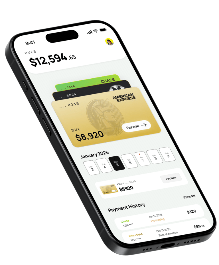
WHAT DO I OWE THIS MONTH?
This was the core UX problem I set out to solve. Users don’t struggle to make payments, they struggle to understand what they owe at any given moment. Financial information is fragmented across accounts, apps, and reminders, making even a simple question difficult to answer.
Defining the problem statement
Most people don't struggle to pay bills. Banks make that easy enough. What they struggle with is knowing, at any given moment, what they actually owe across all their accounts - without logging into five different portals, searching three months of email, or trying to remember which card the Netflix is on.
How people integrate the app into their lives and speak about it with their friends will determine whether they come back.
THE DESIGN CONSTRAINT I GAVE MYSELF
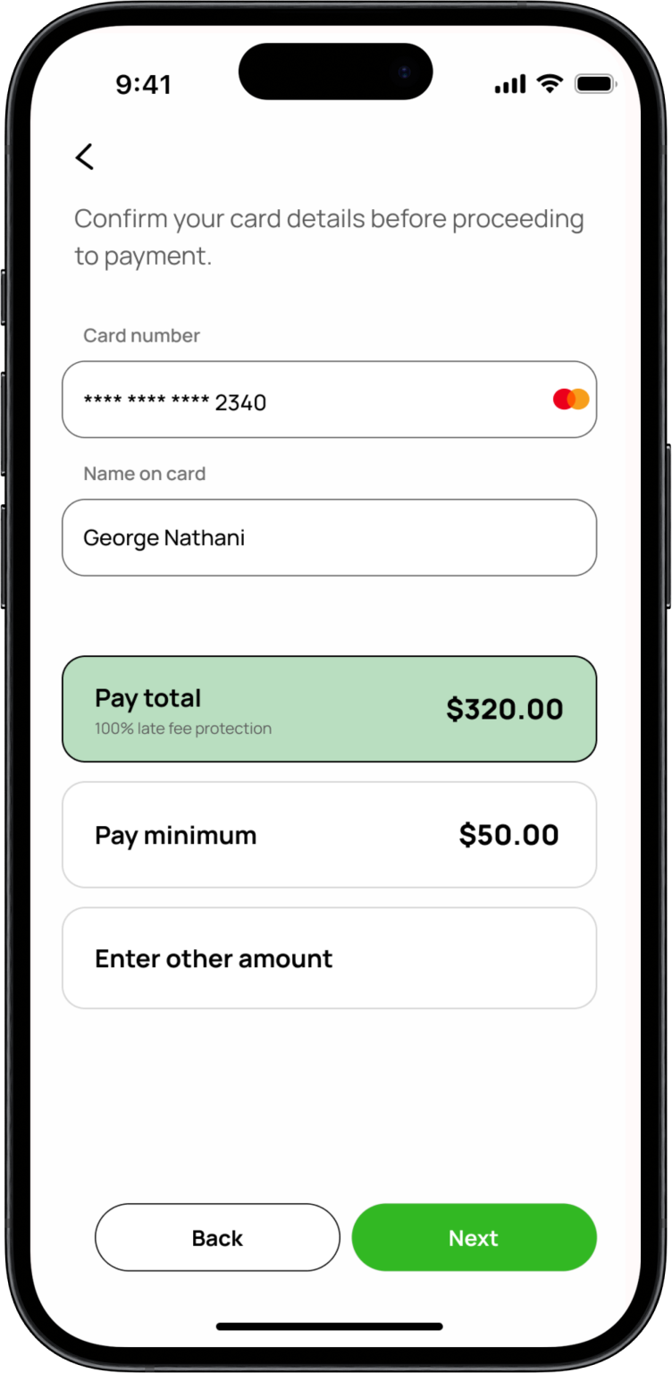
A user must be able to open the app and know their total financial exposure; every bill, every card, every due date, in under 2 seconds. This landing page would be the most impactful space within the product.
Competitive Landscape
Before choosing a direction, I mapped every product an American user might use to manage bills. The landscape splits into five tiers - and the one that matters most to Amalgamic (aggregation + payment) is the weakest.

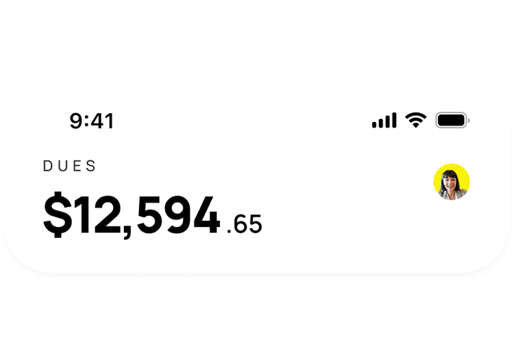
INFORMATION HIERARCHY
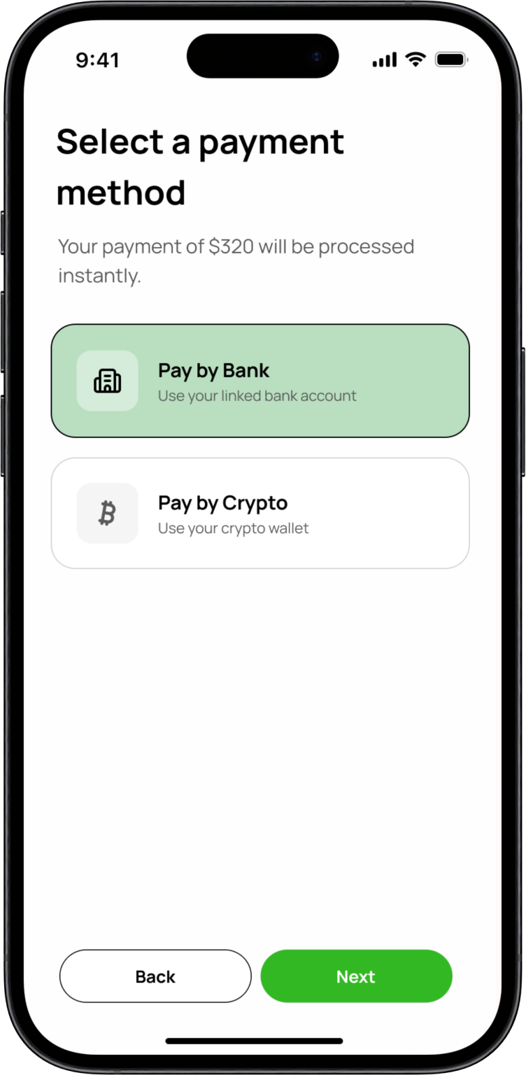
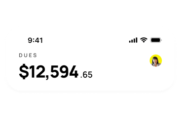
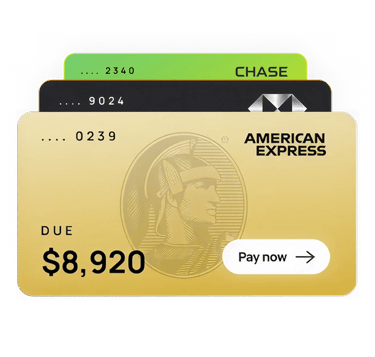
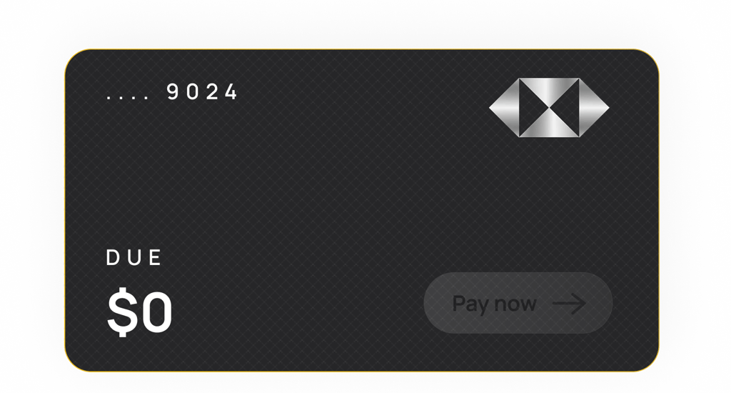
Total dues had to be the the topmost thing on the screen. Not a card, not a welcome message. The number $12,594.65. That's the hero of the product.
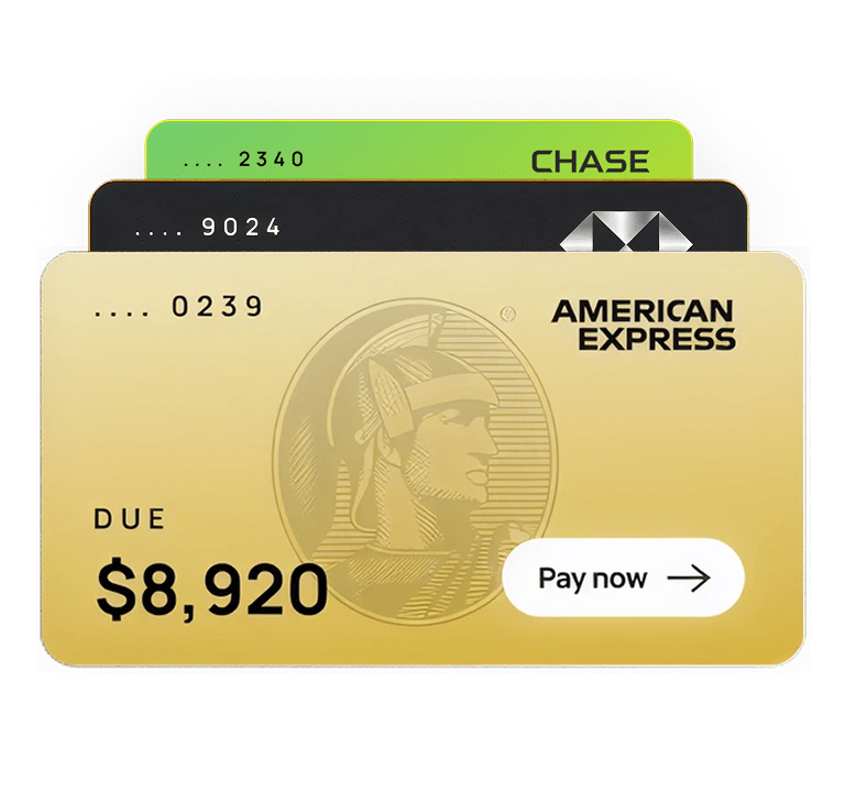
CARD IDENTITY
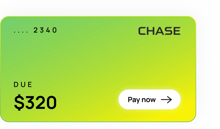
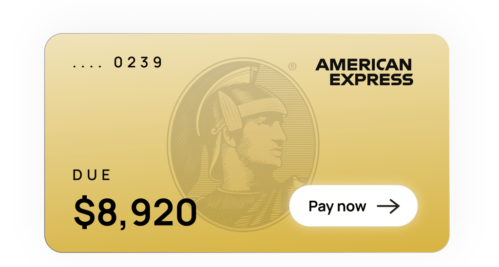
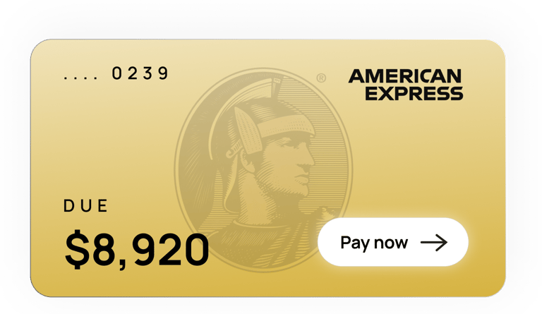
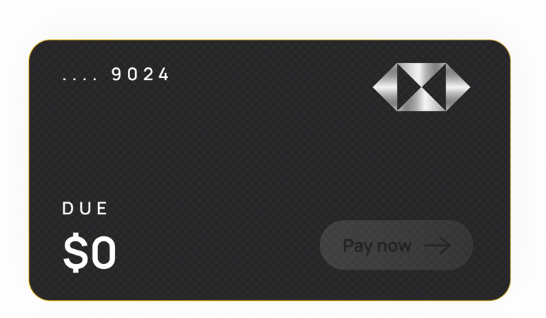
Users need to instantly identify which of their 3–4 cards is which. A list with icons doesn’t achieve that. I designed a system of full-width, physical-style cards that mirror real credit cards gradients, brand colours, logos, and distinctive visual patterns, so users recognise their cards at a glance rather than having to read.
MAKING IT SCALABLE
I built a generative design system using vibe coding that can produce card designs dynamically from a fixed set of variables (colour, typography, imagery, and pattern logic). The system pulls metadata from Plaid and automatically generates visually distinct, on-brand cards for any account, removing the need to manually design each one while maintaining consistency and recognisability across the product.

Visual Decisions - UI
Does this feel like it handles real money? Does this feel calm and trustworthy? Does this look like every other fintech app?
The most important design decision on this project happened before I opened Figma. I needed to pick a visual direction that answered three questions simultaneously: Does this feel like it handles real money? Does this feel calm and trustworthy? Does this look like every other fintech app?
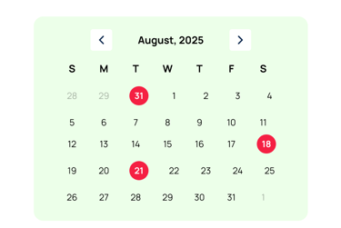
FULL MONTH CALENDAR GRID
X REJECTED
A calendar grid for upcoming bills seems logical — it's how most people think about due dates. But a month grid requires significant cognitive processing. To scan it, you have to find today, look forward, identify highlighted dates, cross-reference with amounts. That's four steps before you've learned anything.
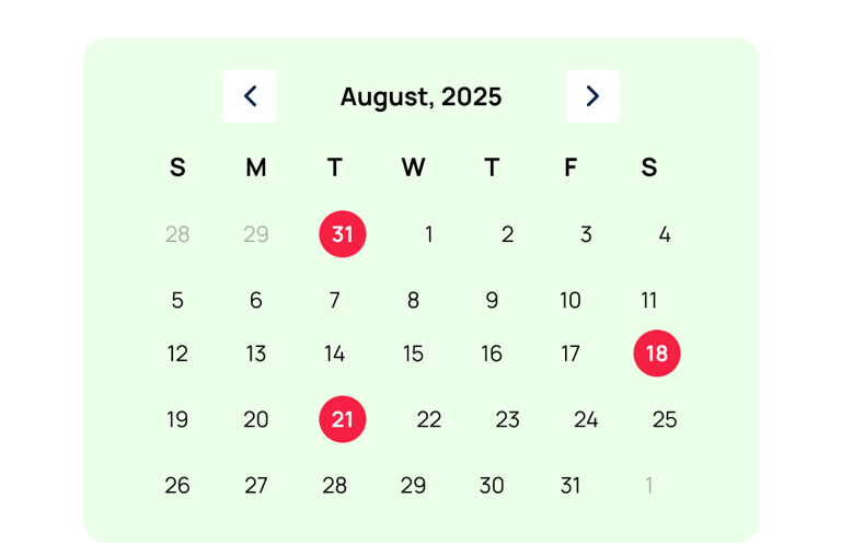
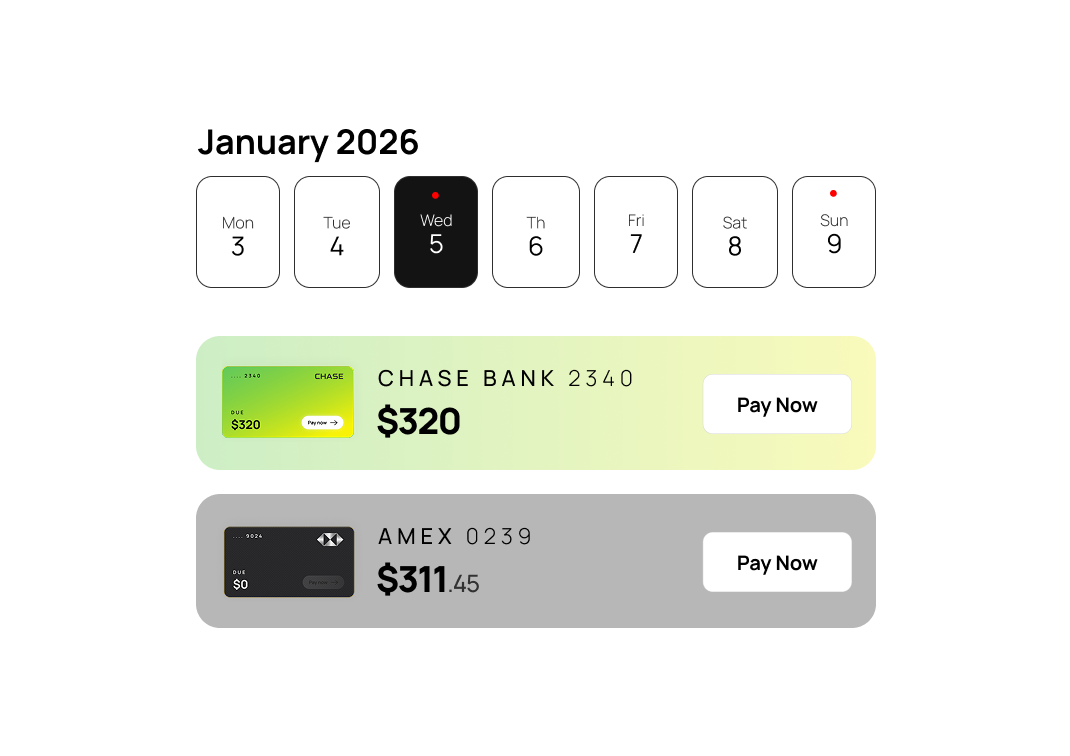
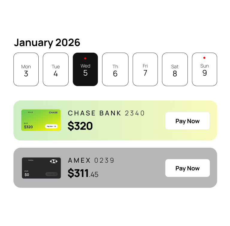
7 DAY HORIZONTAL STRIP
✔️ ACCEPTED
A single week, displayed as a row. Today is highlighted. Days with bills have a dot. The next upcoming bill auto-surfaces as a card directly below the strip. It answers "what's due soon?" in one glance — no processing required. The tradeoff (you lose long-range visibility) is acceptable because power users can go deeper; casual users just need the next 7 days.
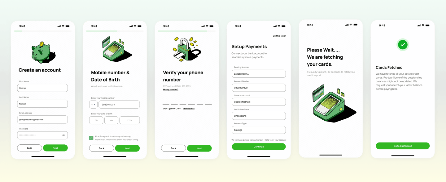
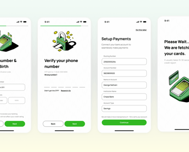
Onboarding
The landing page and auth screens are where most users form their opinion of Amalgamic before they've seen a single feature. I used Firefly AI to generate distinct images that portray security. I then used those images as a base to generate more illustrations to sprinkle within the app while maintaining consistency.