Ginger: A voice-led AI app

AIPRODUCTSAAS

Designing AI interview experiences for first-round recruitment.

Ginger is an AI-driven voice recruiter used by companies to screen candidates through natural, human-like conversations. I joined as the founding designer to lead the end-to-end product design from research to UI, prototyping and conversational design, including the design of a recruiter-facing dashboard to manage jobs and seamlessly integrate backend workflows.

Timeline: 6 months

Role: LLMs, Product Design, Animation, SaaS

Tools: Figma, Cursor, Framer

ginger

About Ginger

Ginger is an AI-driven voice recruiter used by companies to screen candidates through natural, human-like conversations. I joined as the founding designer to lead the end-to-end product design from research to UI, prototyping and conversational design.

THE PRIMARY CHALLENGE

First-round phone screens are one of the biggest bottlenecks for recruiters. They’re repetitive, hard to scale, and highly inconsistent from one interviewer to another. Meanwhile, candidates often feel anxious, rushed, or judged in the first five seconds.

PRODUCT PLACEMENT

  • No more back-and-forth: Reach out to candidates, invite them to a voice screen, and follow up.

  • Higher engagement: Allow candidates to take assessments at any time of the day.

  • Instant insights: Get interview summaries based on role specific probes.

  • Scale effortlessly: Screen hundreds of candidates daily without adding recruiters.

DESIGN SOLUTION (MY BRIEF)

I designed a voice-led interview experience that blended an LLM with ElevenLabs to create natural, human-like conversations. My focus was on crafting an interface and flow that helped candidates feel comfortable, understood and at ease while speaking to an AI.

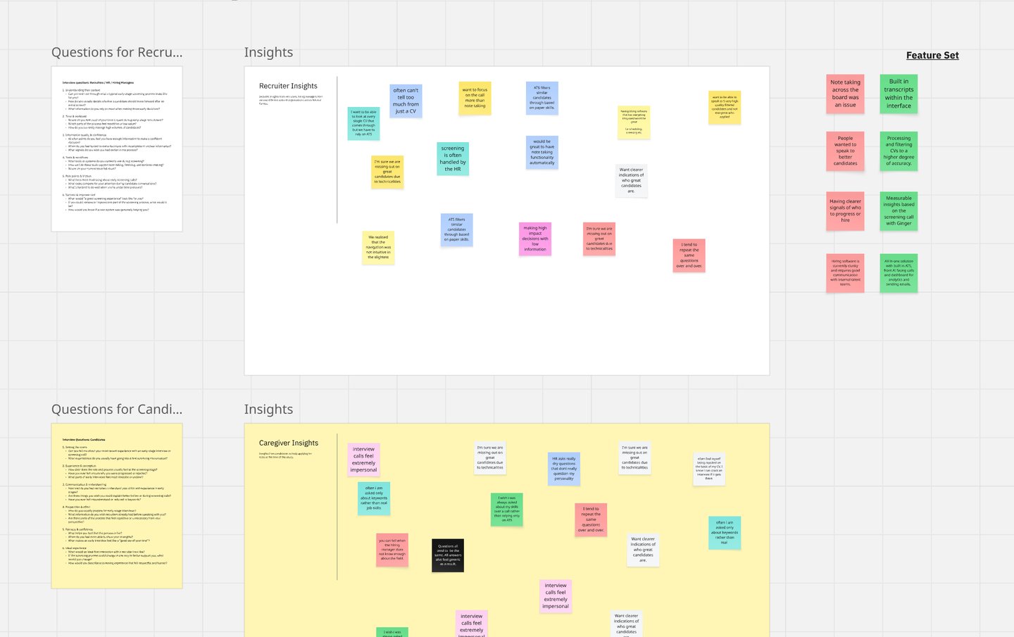
We conducted research with 22 recruiters and hiring managers across Europe and NA and this is what we learned.

RECRUITERS CAN'T SCALE MEANINGFUL CONVERSATIONS

They spent 60%+ of their time on repetitive early screening calls but felt pressured to make decisions based on thin information.

VOICE AI CAN FEEL UNCANNY OR UNCOMFORTABLE IF POORLY DESIGNED

When tone, pacing, or conversational flow doesn’t align with human expectations, users experience friction rather than support.

EARLY INTERVIEWS FEEL UNNATURAL AND CHALLENGING

Candidates said they often over-prepare, freeze, or feel judged. Traditional ATS tools feel cold or robotic, causing drop-offs or shallow answers.

“I spent 60%+ of my time on repetitive early screening calls but felt pressured to make decisions based on thin information.”

“I don’t like note taking while listening to candidates speak and often forget key points if I wait to take them down later”

“We handle a large volume of applicants which makes it difficult to screen”

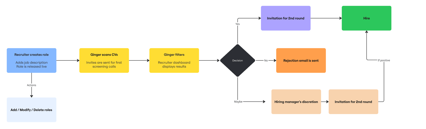
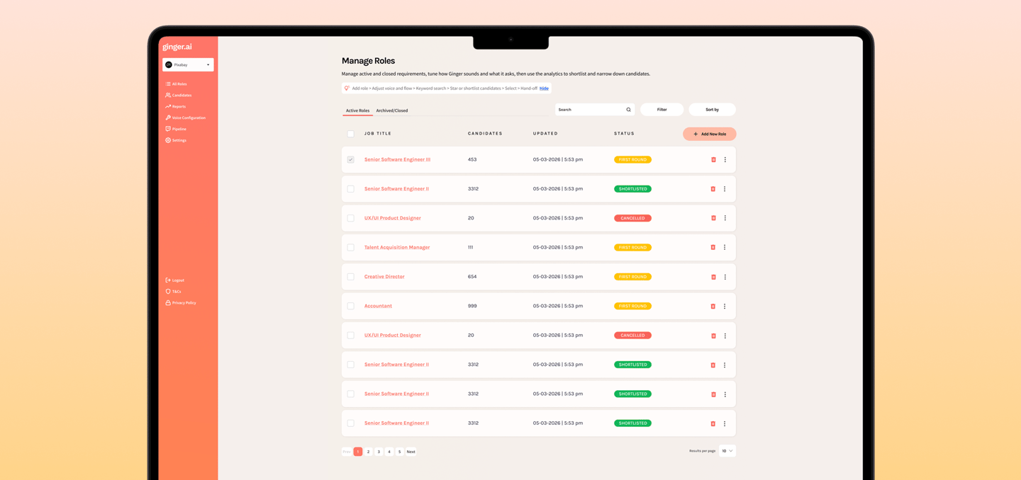
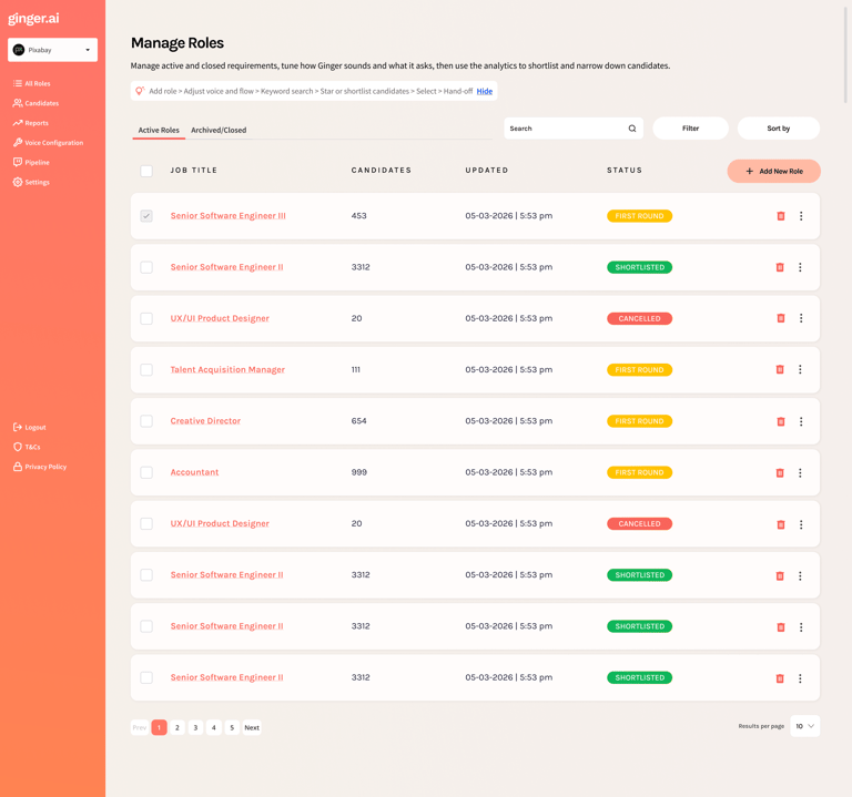
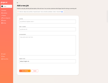
I designed the recruiter view around one question: “If you only had two minutes, what would you need to see?” The answer was counts at the top, a scannable list in the middle, and a single place to open the full story—summary, strengths, risks, and the transcript—without hunting through tools.

WHAT YOU ARE LOOKING AT IN THE MOCKUP

  • Header — job title, search, filter, and sort so the list stays usable when there are hundreds of applicants.

  • Summary tiles — four numbers that tell the health of this req at a glance (who is left in the funnel and how the AI grouped them).

  • Candidate rows — name, what to watch for (“risk”), what stood out (“key strength”), and a clear Hire / Consider / Do not hire badge.

  • Expand a row — short narrative plus bullet strengths (and weaknesses when they exist) so the team can discuss a person from shared facts.

  • Pagination — familiar controls at the bottom so nobody feels trapped on an endless scroll.

Recruiter Dashboard Views

RECRUITER ROLE MANAGEMENT


I designed a recruiter-facing dashboard to manage roles, track candidate progress, and streamline hiring workflows. The experience is centred around roles as the primary unit, with a clear, scannable table that surfaces job titles, candidate volume, status, and last updated timestamps.

Introduced colour-coded status tags and quick actions to help recruiters assess and act at a glance, alongside search, filter, and bulk selection to support scale. The dashboard is tightly integrated with backend workflows, allowing recruiters to create roles, adjust voice flows, and manage candidates in one place.

CUSTOMISATION OF JOB LISTINGS


The form focuses on essential inputs like job title, team or location, and job description, keeping the experience lightweight and easy to complete.

Used clear field hierarchy and generous spacing to reduce cognitive load, with familiar input patterns so recruiters can move through the form without overthinking.

Integrated voice configuration directly into the flow, allowing recruiters to define how Ginger sounds at the point of setup rather than as a separate step.

CUSTOMISATION OF JOB LISTINGS

I designed a simple flow that lets recruiters control how Ginger speaks and what it says during interviews. Everything from tone and pace to key messages is in one place so it’s easy to set up.

Structured it around real moments in a conversation like the intro and closing, so it feels familiar and easy to edit. Added must-ask topics to make sure important questions are always covered, while still keeping the interaction natural.

THESE INSIGHTS NARROWED OUR SCOPE

Design a voice experience that feels like talking to a thoughtful, patient human and not an algorithm

MY FOCUS AREA

THE VOICE INTERVIEW EXPERIENCE

I intentionally scoped into ONE product surface:
The real-time voice interview flow.

This required orchestrating three layers simultaneously:

Human-centered conversational UX

Goal: Make the AI feel calm, safe and natural to talk to.

LLM reasoning + adaptive questioning

Goal: Make the AI ask smart, relevant, non-scripted questions

Natural voice output via Eleven Labs

Goal: Make the AI sound human without being uncanny.

Customer facing AI

Batch vs stream processing

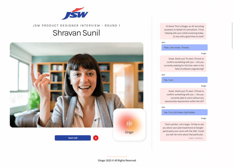
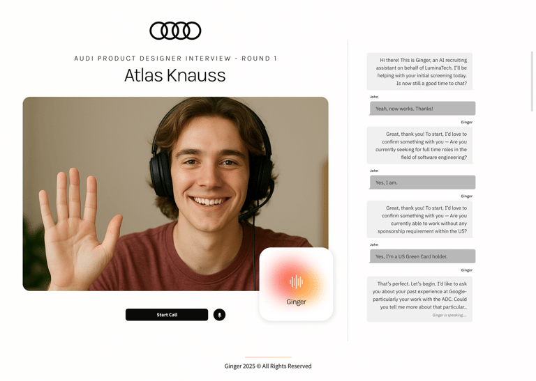
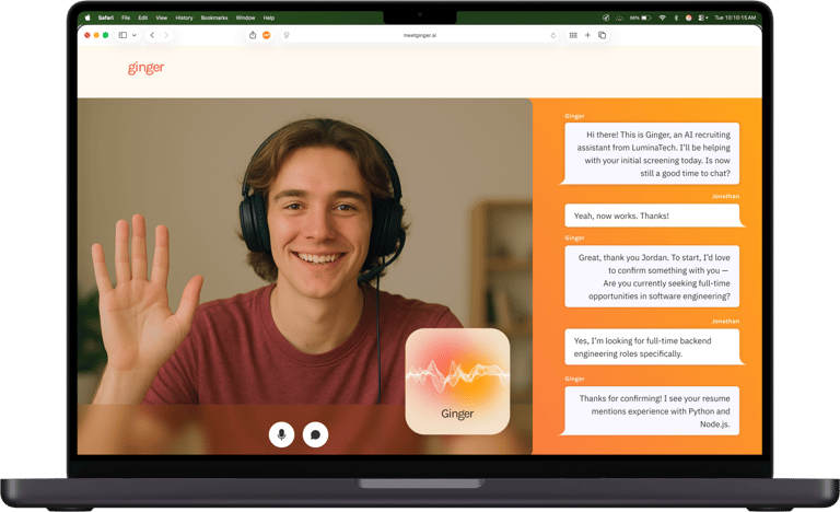
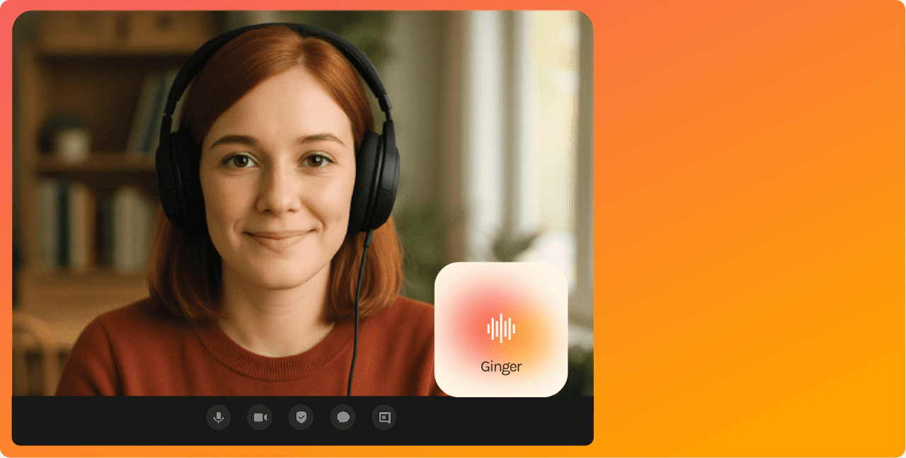
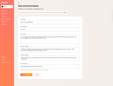
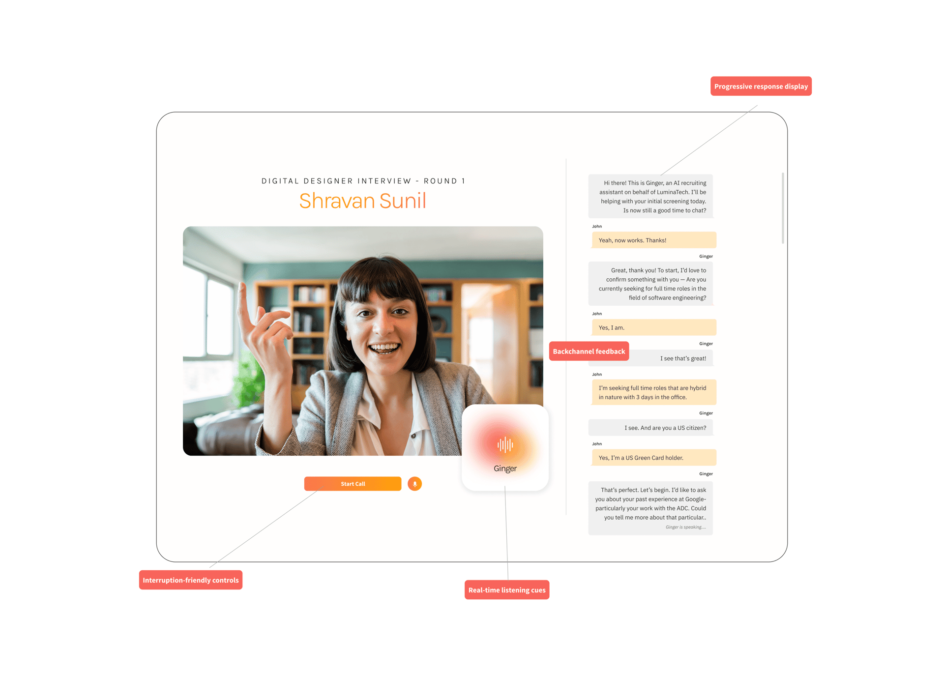
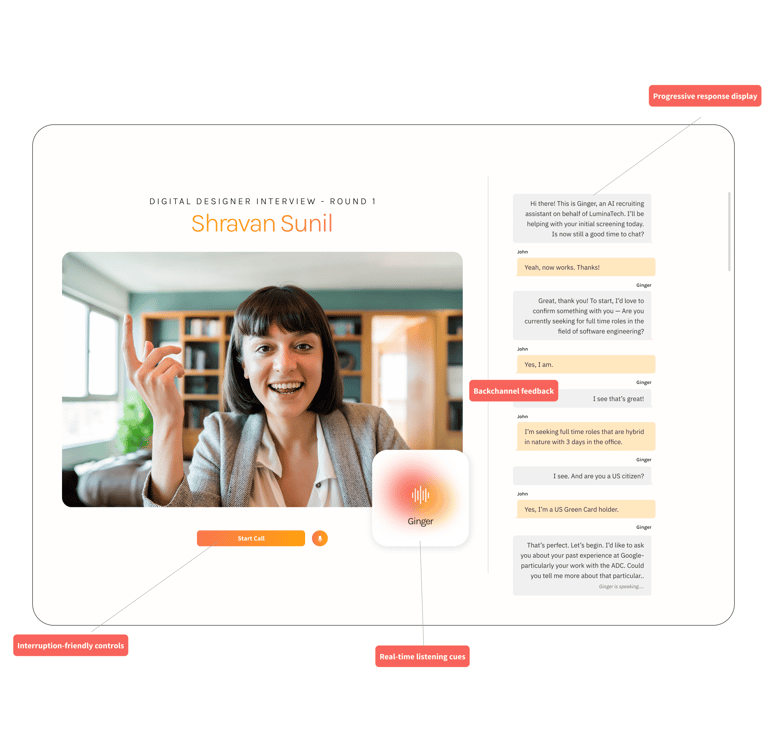
VOICE AI - UX ENHANCEMENTS

Implemented
real-time listening cues such as animated waveforms, avatars, and dynamic “listening…” indicators to show attentiveness.

Suggested developers to add
backchannel feedback like “uh-huh,” nods, and subtle visual signals to mimic natural human listening.

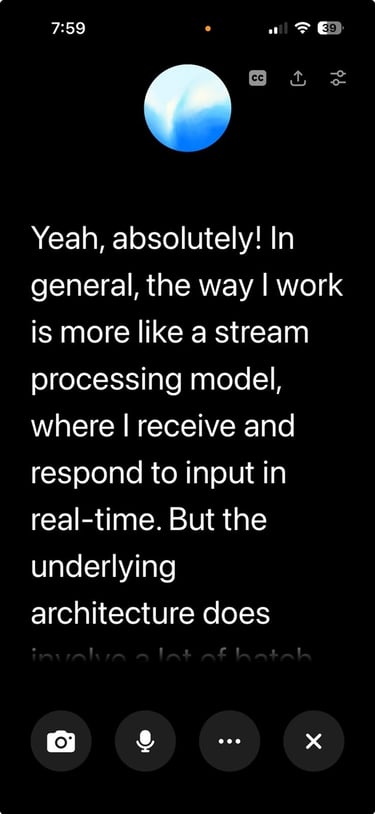
Introduced
progressive response display (as transcrispts) so users could see AI responses unfolding as they were generated.

Designed
interruption-friendly controls allowing users to speak, pause, or redirect the AI mid-response.

WHITE LABEL PRODUCTS CUSTOMISED FOR OUR CLIENTS